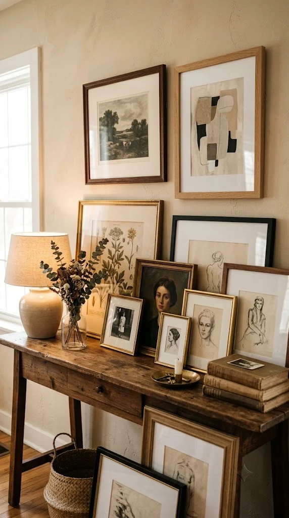
20 Beautiful Wall Decor Living Room Ideas (With Real Hanging & Spacing Rules)
I’ve hung more gallery walls and statement pieces than I can count, and the difference between a wall that looks professionally styled and one that looks randomly assembled almost always comes down to a few measurable rules — hanging height, spacing, and proportion to the wall itself. Below are 20 wall decor ideas for a living room, each with the practical specifics most roundups skip, plus the core hanging rules to apply no matter which style you choose.
The Rules Every Wall Decor Idea Should Follow
Hanging height: The center of any art piece should sit roughly 57-60 inches from the floor — this is the standard museum height and reads as correctly placed to the eye regardless of ceiling height. Above furniture, this shifts to roughly 6-8 inches above the piece itself (a sofa, console, or mantel).
Gallery wall spacing: Leave 2-3 inches between individual frames in a grouped arrangement. Tighter spacing reads as cluttered; wider spacing makes the grouping look like disconnected, accidental pieces rather than one intentional display.
Size-to-wall ratio: For a single statement piece above a sofa or console, aim for artwork roughly two-thirds the width of the furniture below it. Art that’s much narrower looks stranded; art wider than the furniture can work, but only if intentionally oversized as a full statement.
1. Large Single Statement Piece
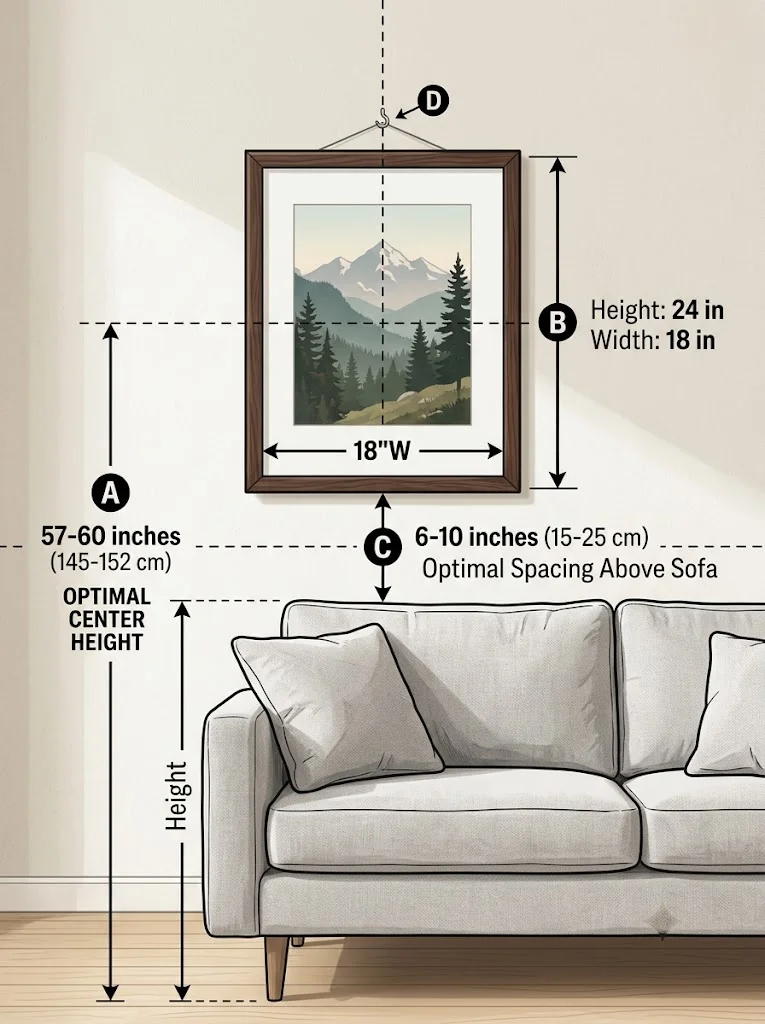
One oversized piece of art or a large mirror above the sofa remains one of the most reliable wall decor choices, since it avoids the spacing math a gallery wall requires entirely. Follow the two-thirds sofa-width rule and hang the center 6-8 inches above the sofa back.
Budget tier: mid-to-high, since large-format art or mirrors cost more per square foot than smaller framed pieces.
2. Classic Gallery Wall Grid
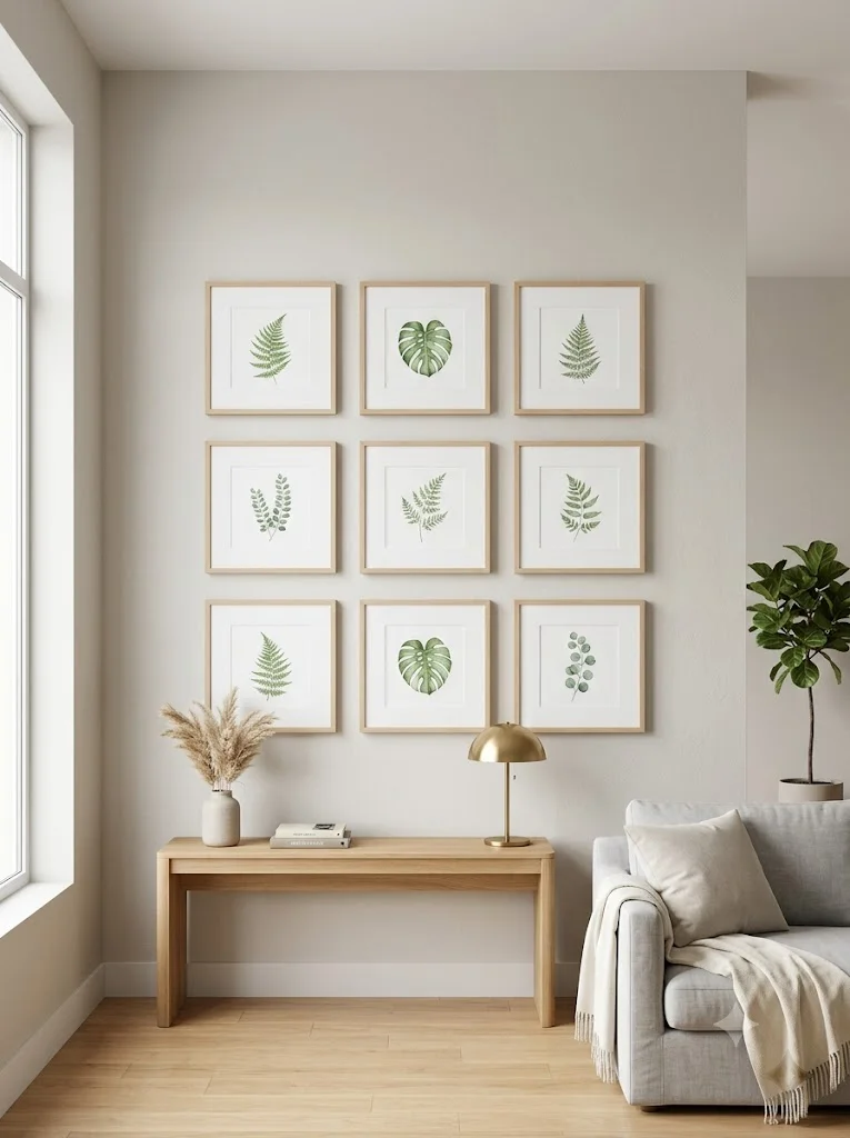
A grid of same-sized frames in a clean rows-and-columns layout is the most beginner-friendly gallery wall style, since the math is simple: equal spacing (2-3 inches) both horizontally and vertically across the whole grid.
I’d lay the frames out on the floor first in the exact grid pattern, measure the spacing there, then transfer those measurements to the wall with painter’s tape before hammering a single nail.
3. Salon-Style Eclectic Gallery Wall
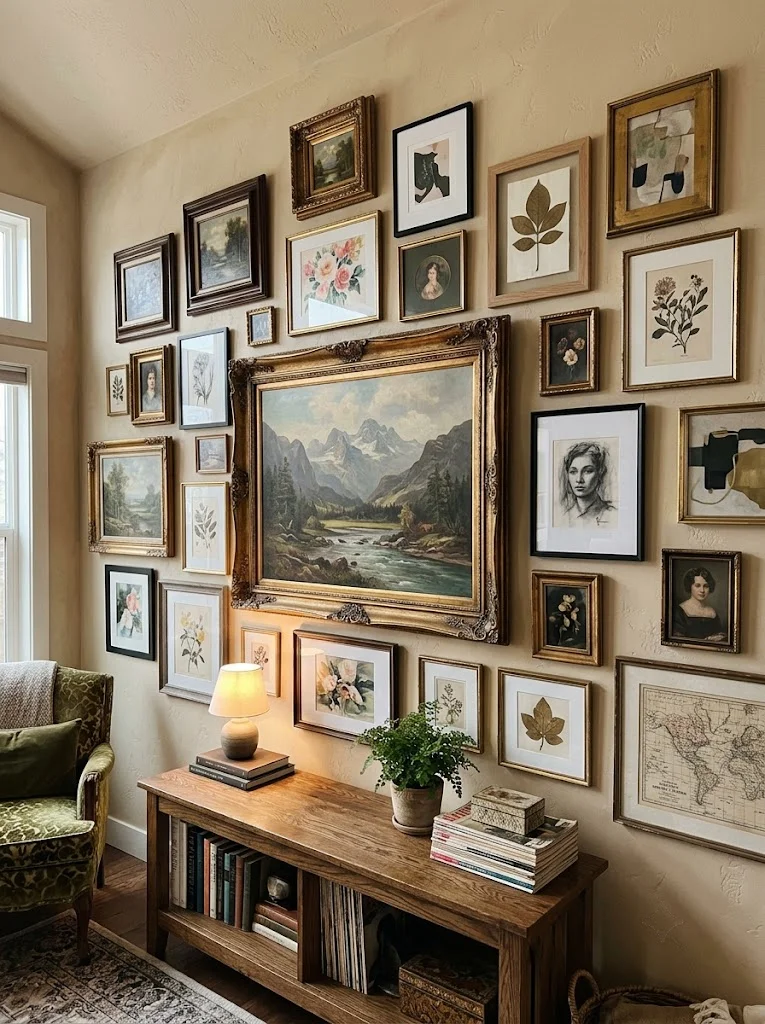
Mixing frame sizes, finishes, and orientations creates a more collected-over-time look than a matching grid, but it needs one anchor piece — typically the largest frame — placed first and roughly centered, with smaller pieces built outward from it.
Budget tier: low-to-mid, since this style is ideal for mixing thrifted frames with a few new ones without needing a matching set.
4. Floating Shelf Display Wall
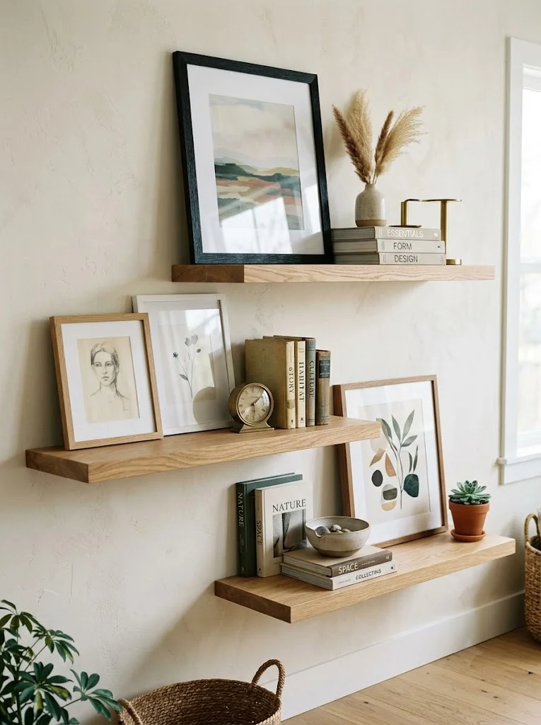
Floating shelves mounted at staggered heights let you layer framed art, small objects, and books rather than committing to fixed nail placements — genuinely useful if you like to change your display periodically.
Mount shelves 8-10 inches apart vertically if stacking multiple rows, and lean rather than hang the art itself for easy rotation.
5. Woven Textile or Tapestry
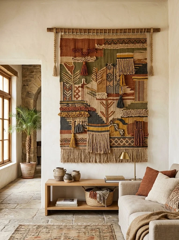
A single woven textile or tapestry adds texture without needing frames or precise spacing math at all — just center it on the wall at the same 57-60 inch eye-level guideline, adjusted for the piece’s own height.
This works especially well on a large, otherwise bare wall where multiple smaller framed pieces would require more planning than a single textile.
6. Mirror Cluster Arrangement
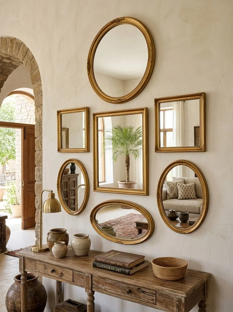
Grouping 3-5 mirrors of varying shapes and sizes multiplies the light-reflecting benefit of a single mirror while creating visual interest through the cluster itself.
I’d keep the same 2-3 inch spacing rule as a gallery wall, and stick to a single frame finish (all brass, or all black) across the cluster so the varying shapes don’t compete with varying metal tones as well.
Budget tier: mid, since multiple mirrors add up faster than multiple simple frames.
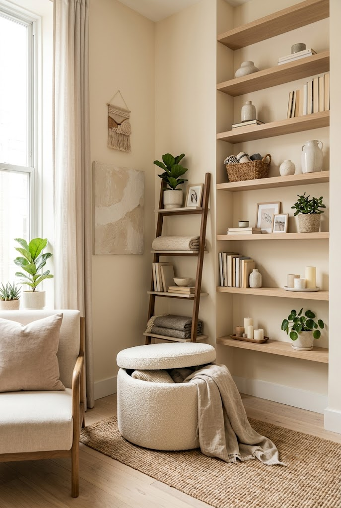
7. Vertical Leaning Ladder Art
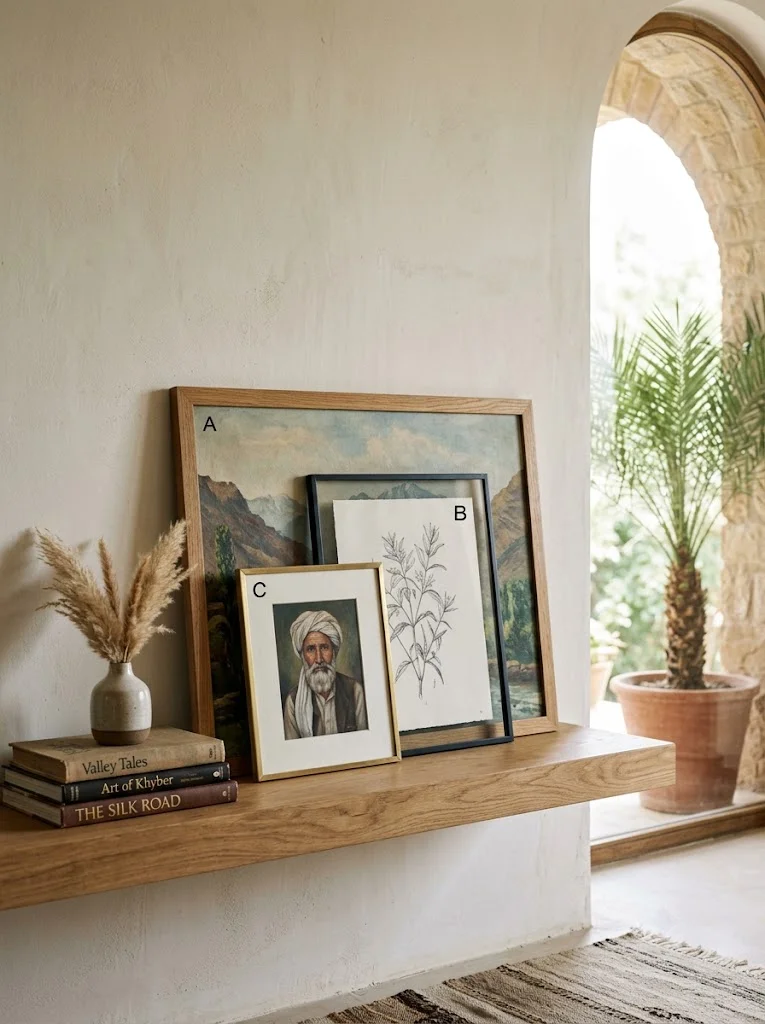
Leaning 2-3 progressively smaller framed pieces against the wall on a floating shelf or console, rather than hanging them, creates a relaxed, layered look and requires zero measuring or nail placement at all.
This is one of the lowest-commitment options on this list — genuinely useful if you rent or like to change your art often.
8. Woven Wall Basket Arrangement
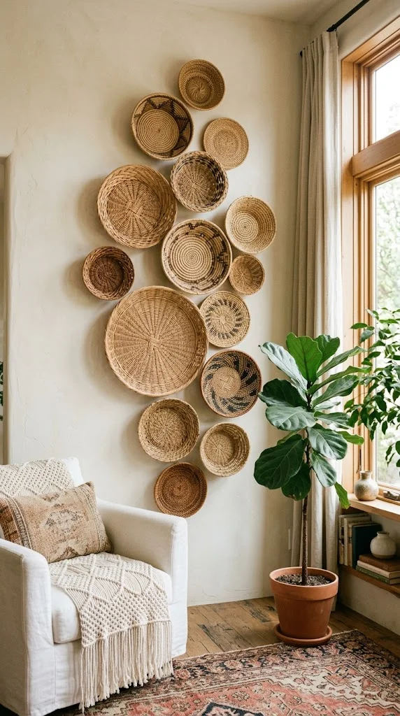
Grouping wicker or woven baskets in a cluster of varying sizes adds texture and a boho warmth without any glass or framing at all. Mount using small nails or hooks through the basket’s existing weave, keeping the same 2-3 inch spacing between pieces.
Budget tier: low, since wall baskets are typically inexpensive individually even when grouped in a larger cluster.
9. Oversized Clock as Focal Point
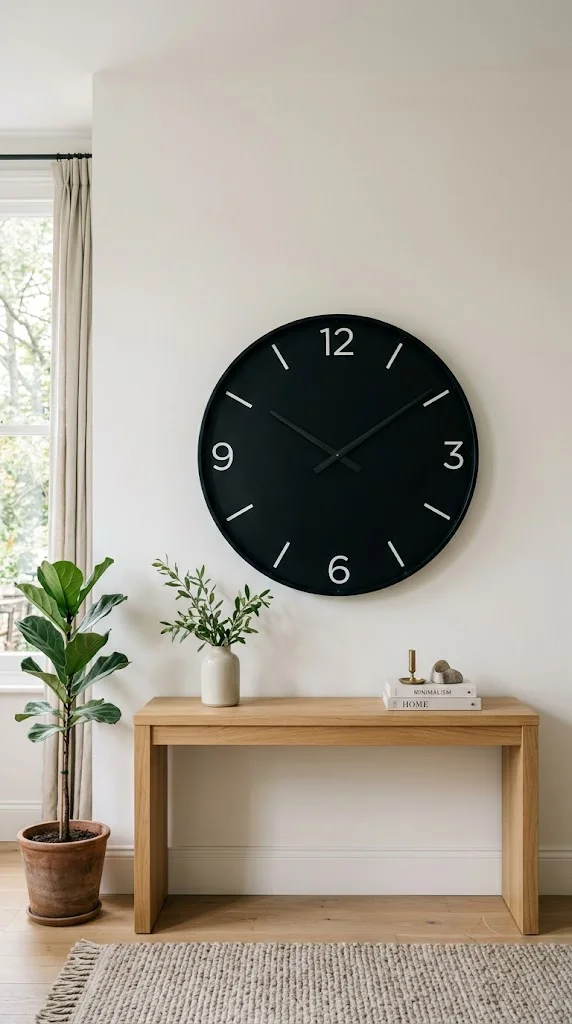
A large statement clock functions as both decor and function, and follows the same sizing logic as a single statement art piece — roughly two-thirds the width of the furniture it’s centered above.
I’d avoid pairing an oversized clock with a busy gallery wall nearby, since the clock’s circular shape and function already draws significant visual weight on its own.
10. Plate Wall Display
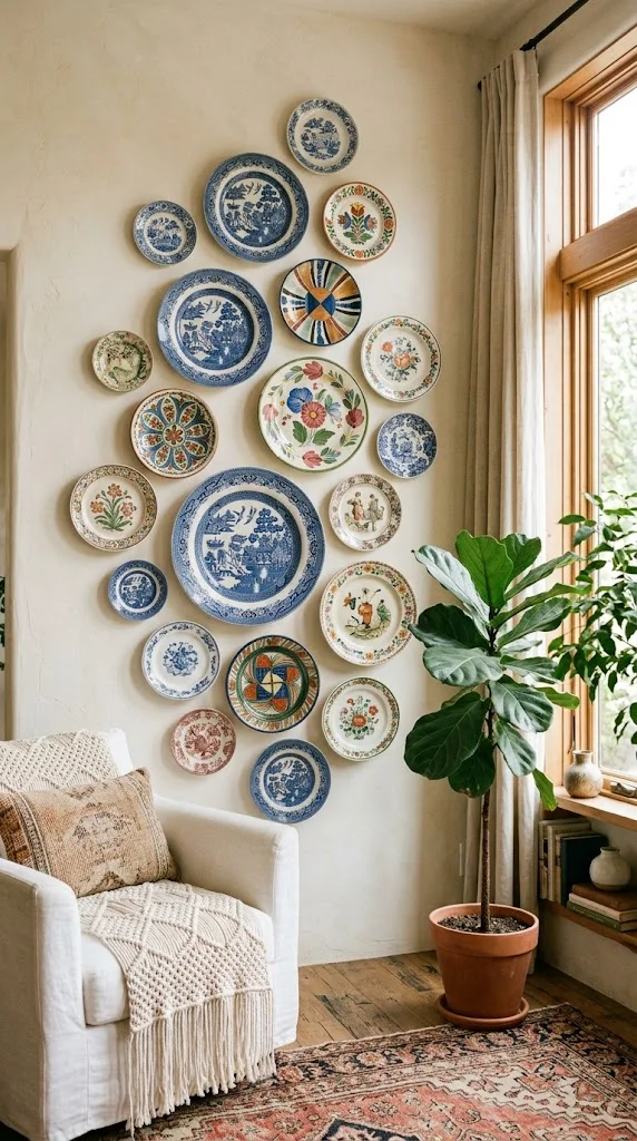
Decorative plates mounted in a curated arrangement create a distinctive, collected look, typically using plate hangers (spring-wire mounts) rather than nails through the plate itself.
Vary plate sizes for visual rhythm the same way you would with mixed picture frames, keeping the same 2-3 inch spacing between pieces for a cohesive cluster.
11. Botanical Pressed Art
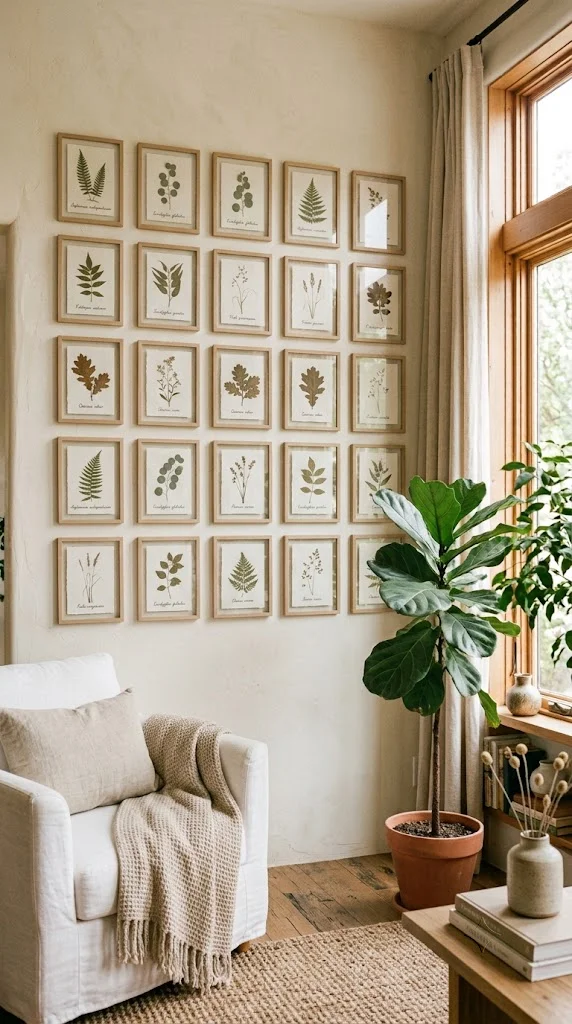
Simple pressed leaf or botanical prints in matching thin frames work well as a subtle, low-contrast gallery wall option, especially in a room with an otherwise busy or textured color palette elsewhere.
I’d keep this style in a tight grid (rule #2 above) rather than eclectic spacing, since the subtlety of the subject matter benefits from a more orderly, calm presentation.
12. Wall-Mounted Plant Display
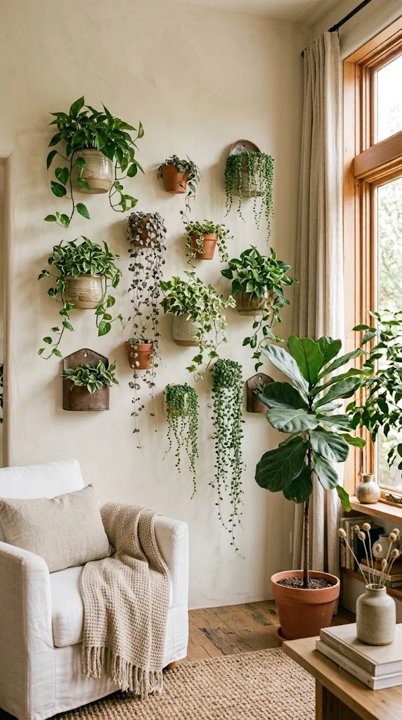
Combining wall-mounted planters with trailing plants adds living texture to an otherwise flat wall. Stagger 2-3 planters at different heights (roughly 8-12 inches apart vertically) rather than a single row for a more natural look.
Budget tier: low-to-mid, and requires more ongoing maintenance than any static wall decor option on this list.
13. Fabric or Wallpaper Accent Panel
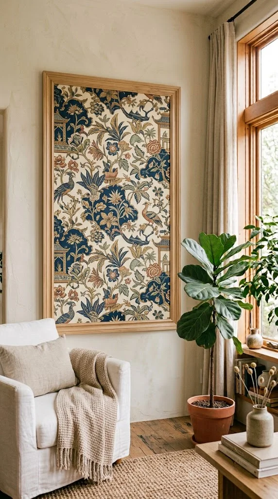
Rather than covering a full wall, a single fabric or wallpaper panel — framed with simple wood trim — creates a large-scale accent without the commitment or cost of wallpapering an entire wall.
Size the panel using the same two-thirds furniture-width rule as a single art piece if it’s positioned above a sofa or console.
14. Sculptural Wood Wall Art
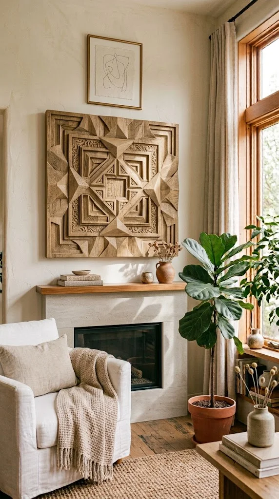
A single dimensional wood art piece (carved, layered, or slatted) adds texture through shadow and light rather than color or pattern, and works well as a genuine alternative to a flat framed piece above a fireplace or sofa.
I’d check the mounting hardware rating carefully here, since dimensional wood pieces are often heavier than framed art of the same size and need wall anchors rated accordingly.
15. Layered Frame Collage (Leaning + Hanging Mix)
Combining a few hung pieces with a few leaning pieces on a nearby shelf or console creates depth that a fully hung, flat gallery wall can’t achieve on its own.
I’d hang the “anchor” pieces using the standard height and spacing rules, then let the leaning pieces overlap slightly at the base for a more collected, layered feel.
16. Black-and-White Photo Gallery
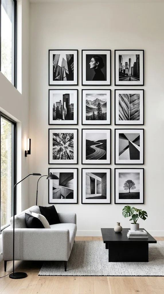
A gallery wall using exclusively black-and-white photography (personal or purchased prints) creates cohesion automatically, since the limited palette does the visual organizing work that mixed colors would otherwise require more planning to balance.
Matching frame finishes (all black, or all white) reinforces this cohesion further and simplifies the whole layout decision.
17. Woven Macrame Wall Hanging
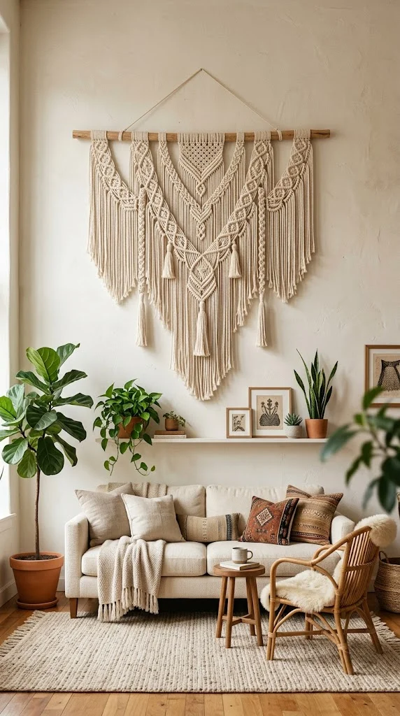
A single large macrame piece, centered at standard eye-level height, adds texture and a handmade quality without any framing, spacing math, or grouping decisions at all.
This pairs particularly well with a boho or neutral-toned living room where the macrame’s natural cotton or jute tone can stand alone as the wall’s primary visual interest.
18. Modular Geometric Shelving
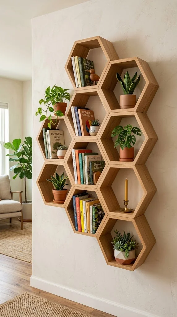
Hexagon or geometric modular shelf units mounted directly to the wall combine storage and display, and can be added to incrementally rather than requiring the full arrangement to be planned and mounted at once.
I’d start with 3-4 units in a cluster and expand later, rather than committing to a large modular layout before knowing how it’ll actually be used for display.
19. Neutral Abstract Art Duo or Trio
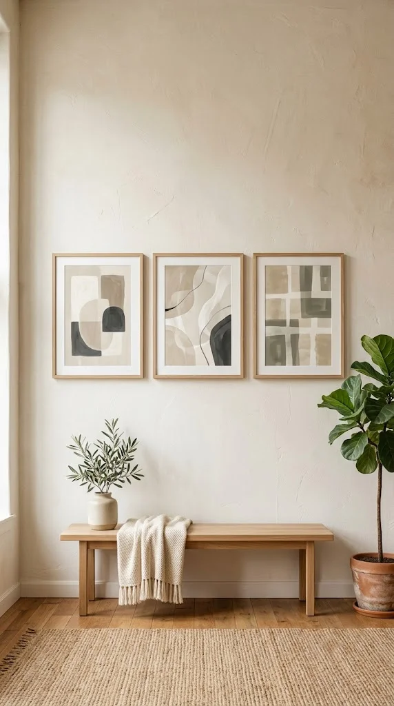
Rather than a single large piece, 2-3 smaller abstract prints in a matching or complementary palette, spaced evenly (using the 2-3 inch rule if hung close together, or wider intentional gaps if spread across a longer wall) creates a curated look without needing a full gallery wall’s worth of pieces.
Budget tier: low-to-mid, especially with printable or poster-style abstract art rather than framed originals.
20. Architectural Molding or Panel Wall
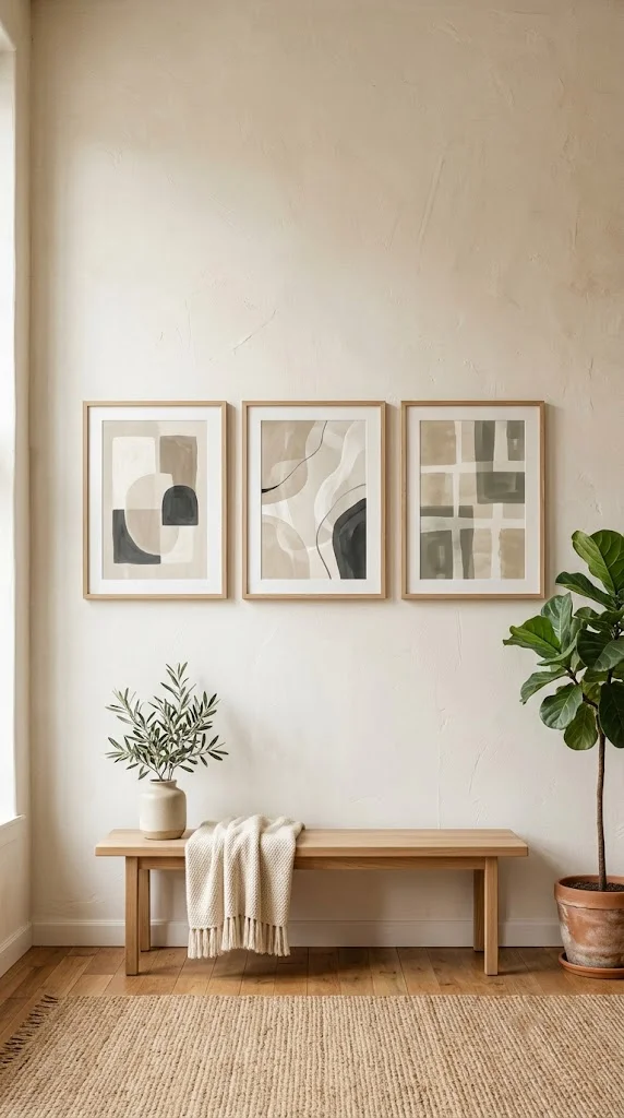
Adding picture-frame molding or wall paneling directly to the wall itself (painted to match or contrast the wall color) creates dimensional interest without needing any hung art at all, and can serve as a backdrop for a smaller, more minimal art piece layered on top.
This is a more involved, semi-permanent project compared to anything else on this list, and generally better suited to homeowners than renters given the wall modification involved.
My Professional Guide to Planning a Wall Decor Layout
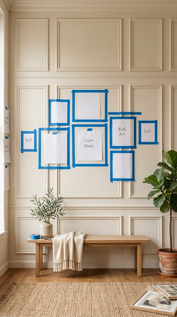
I always start with the wall’s actual dimensions and the furniture already in front of it, not the art itself. Measuring the available wall space and the width of any furniture below it tells you immediately whether you’re working with a single-statement-piece wall or a wall that can support a full gallery grouping.
From there, I plan the layout on the floor or with paper templates taped to the wall before a single nail goes in. This is especially important for gallery walls, where the visual math of spacing and alignment is much easier to adjust on paper than after multiple pieces are already hung.
Finally, I’d resist mixing too many of these 20 ideas on a single wall. A large statement mirror competing with a gallery wall competing with a plant display all in one sightline reads as cluttered, regardless of how nice each individual element is. Choose one primary approach per wall, and let secondary elements (a single plant, a small shelf) support it rather than compete with it.
Conclusion
Wall decor in a living room comes down to the same handful of measurable rules regardless of style: correct hanging height, consistent spacing, and proportional sizing to the wall and furniture below it. Choose the idea that matches your room’s style and your wall’s actual dimensions, apply these core rules, and the result will read as intentional rather than randomly assembled.
Frequently Asked Questions
How high should I hang art in a living room?
The center of the piece should sit roughly 57-60 inches from the floor for a standalone wall, or 6-8 inches above furniture like a sofa or console when hung above it.
How much space should be between frames in a gallery wall?
2-3 inches between individual frames is the standard spacing — tighter reads as cluttered, and wider makes the grouping look disconnected.
What size art should I hang above my sofa?
Aim for artwork roughly two-thirds the width of the sofa. Much narrower art looks stranded, though intentionally oversized pieces (wider than the sofa) can work as a deliberate statement.
Do I need a level and stud finder for a gallery wall?
A level is essential for keeping a grid or row aligned. A stud finder matters most for heavier pieces (mirrors, dimensional wood art); lighter framed prints are usually fine with standard picture hooks in drywall alone.
Related Posts
- 25 Small Apartment Living Room Ideas 2026
- Small Living Room Ideas on a Budget
- Shelf Decor Ideas
Follow us on Pinterest for more living room wall decor inspiration!